Portland Center Stage brings "transcendent theatrical performances and community programs" to the public, but their interface, especially on mobile, deters users from finding needed info and actually purchasing tickets.
Although, I'm not affiliated with PCS and did not design this project under an agreement, I'd love to. They bring unique experiences in safe spaces to diverse audiences, and their branding and website should mirror the impact they're making.


Highlights
Highlights
Highlights
More mission, please!
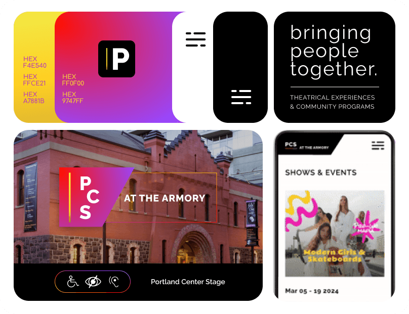
They've got a strong business ethos of diversity and inclusion which shows in statements throughout the website. But there's room to remind the user of their mission more often, instead of only on the About Us page. Mission: We provide "transcendent theatrical performances and community programs" that bring people together.
Calling all the colors!
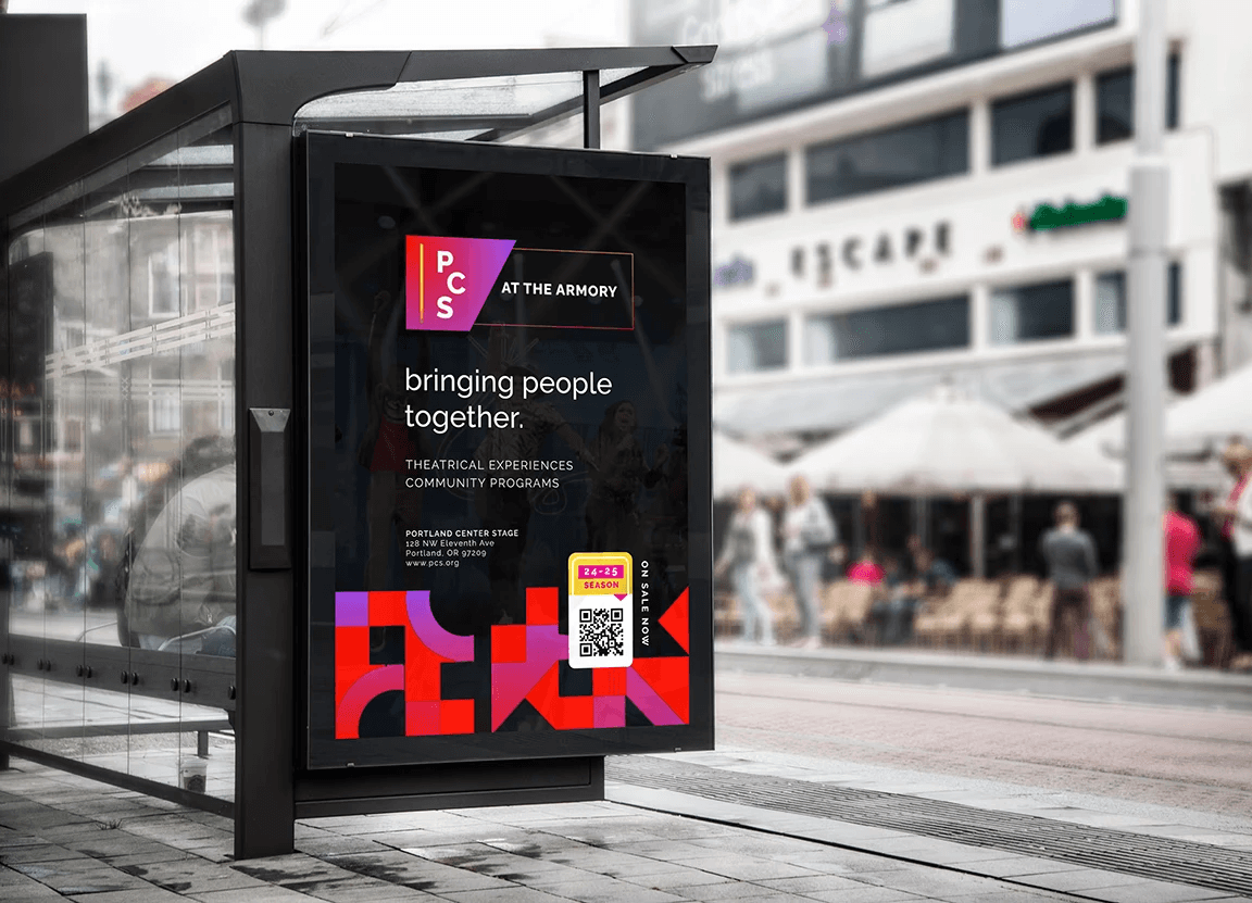
They need a new color(s) in their branding and something special in the logo. (Rainbow strokes and multicolor gradients works well!)
I get why they chose black, white and dark gray - because they promote shows and events that already have their own marketing materials with varying colors and images and they want to be a container for that. But it's doing them a disservice. Nothing about their current branding is memorable.
Adjusting for Accessibility
What's needed? A separate menu with icon tap that presents adjustment options to the user.
They attempt to offer some options, like a link for larger text here or there, but it's inconsistent and given their demographic, needed.
Declutter Down Under
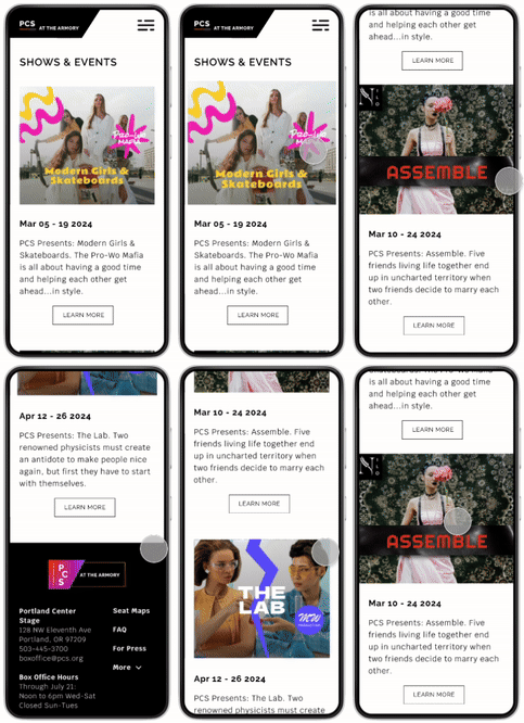
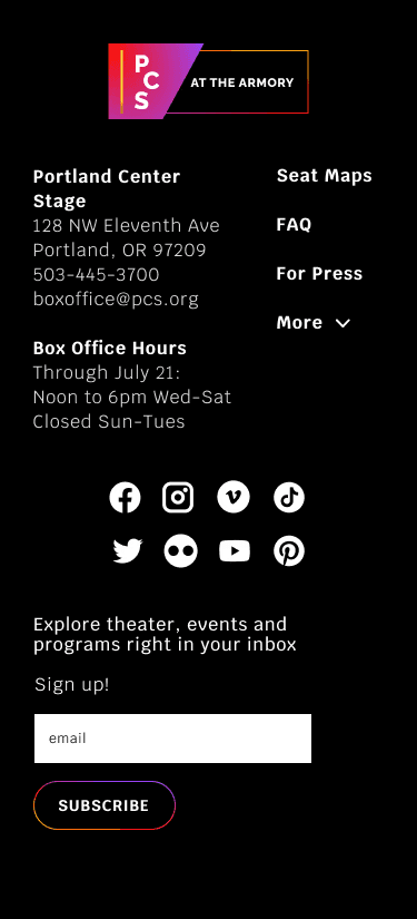
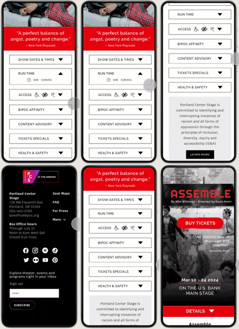
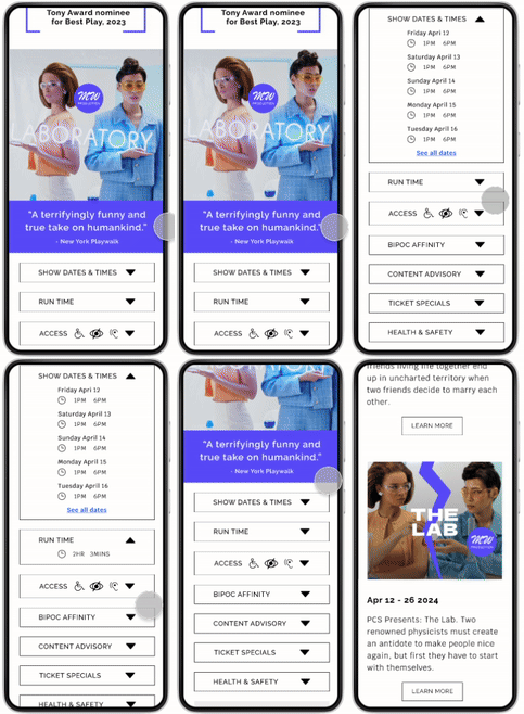
Copy throughout can definitely be more concise, and content needs better organization. I'd also simplify the footer and add more navigation like back buttons and breadcrumb menus.
Are we gonna show it or SHOW IT?
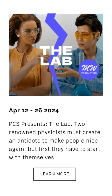
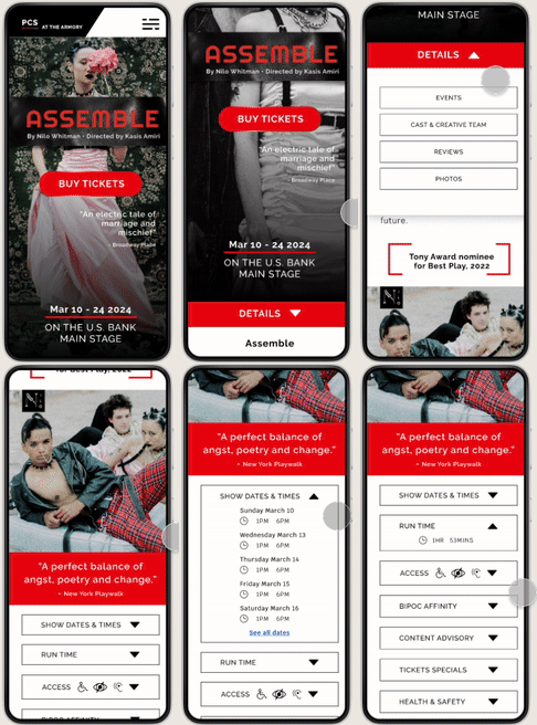
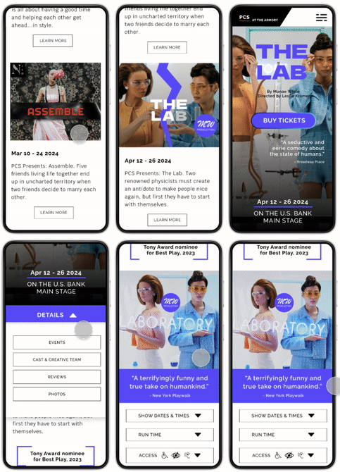
Since they strive to showcase the artistry and attitude of each show and event, I'd create a design that enhances this with larger images, color for buttons and certain sections. Each show or event could feel like they have their own one-page website within PCS.








Process
Process
Process
Step 1
Step 1
Identify Challenge
Their interface is hard to navigate and look at, especially on mobile, which I'm sure is causing people to not complete the intended journey of checking out.
Identify Challenge
Their interface is hard to navigate and look at, especially on mobile, which I'm sure is causing people to not complete the intended journey of checking out.
Identify Challenge
Their interface is hard to navigate and look at, especially on mobile, which I'm sure is causing people to not complete the intended journey of checking out.
Step 2
Step 2
Define Goals
The goals include a new color in the branding and a refresh of the logo, decluttering their website to make copy throughout more concise and content better organized, a simplified footer and more navigation (back, breadcrumb) throughout.
They also need a design that enhances the shows and events they promote and more accessibility adjustment options for the users who need it.
Step 3
Step 3
Define Phases
This would start with an extensive website and business structure review to identify opportunities alongside what was working and what needed improvement. Thereafter, project phases would be clarified.
Define Phases
This would start with an extensive website and business structure review to identify opportunities alongside what was working and what needed improvement. Thereafter, project phases would be clarified.
Define Phases
This would start with an extensive website and business structure review to identify opportunities alongside what was working and what needed improvement. Thereafter, project phases would be clarified.
