Redesigning Stencil Stop's e-commerce website to increase clarity around products, streamline ordering process, repair user issues and realign company with vision for the brand.
Stencil Stop is a Sacramento, California, based manufacturer and supplier of custom stencils of all sizes and designs. They engage with their audience by offering ongoing product support and how-to content.
Redesigning Stencil Stop's e-commerce website to increase clarity around products, streamline ordering process, repair user issues and realign company with vision for the brand. Completed with 4 team members,
Stencil Stop is a Sacramento, California, based manufacturer and supplier of custom stencils of all sizes and designs. They engage with their audience by offering ongoing product support and how-to content.
Redesigning Stencil Stop's e-commerce website to increase clarity around products, streamline ordering process, repair user issues and realign company with vision for the brand.
Stencil Stop is a Sacramento, California, based manufacturer and supplier of custom stencils of all sizes and designs. They engage with their audience by offering ongoing product support and how-to content.


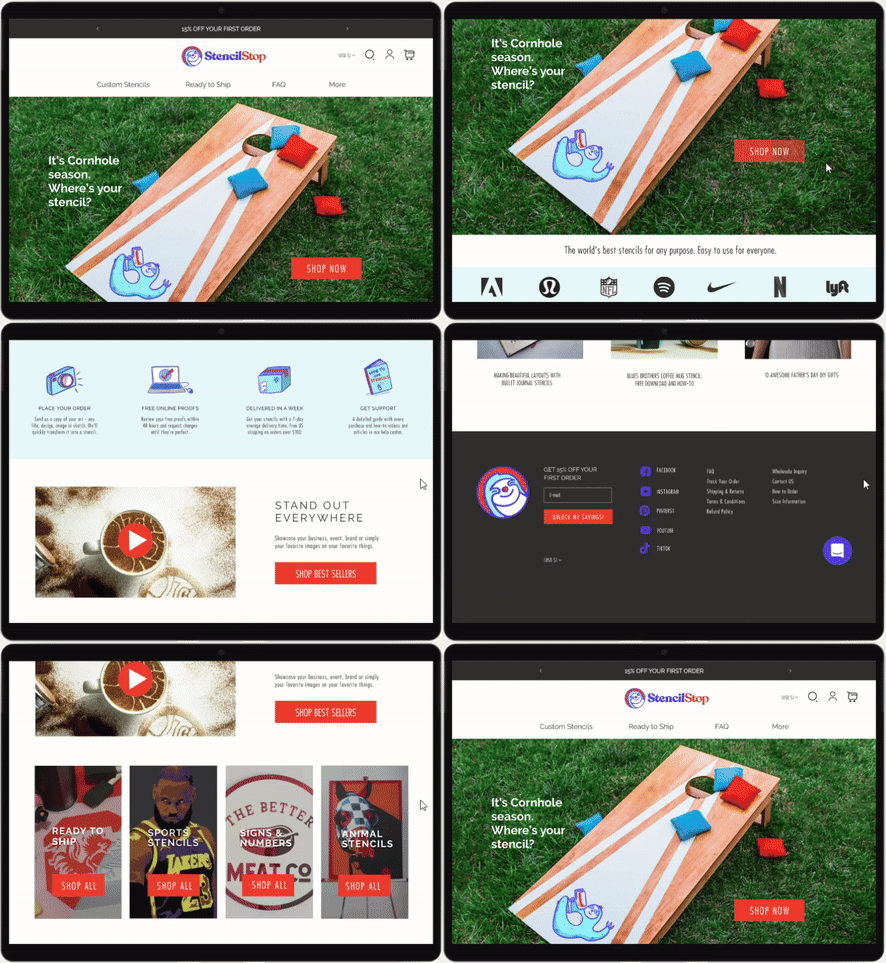

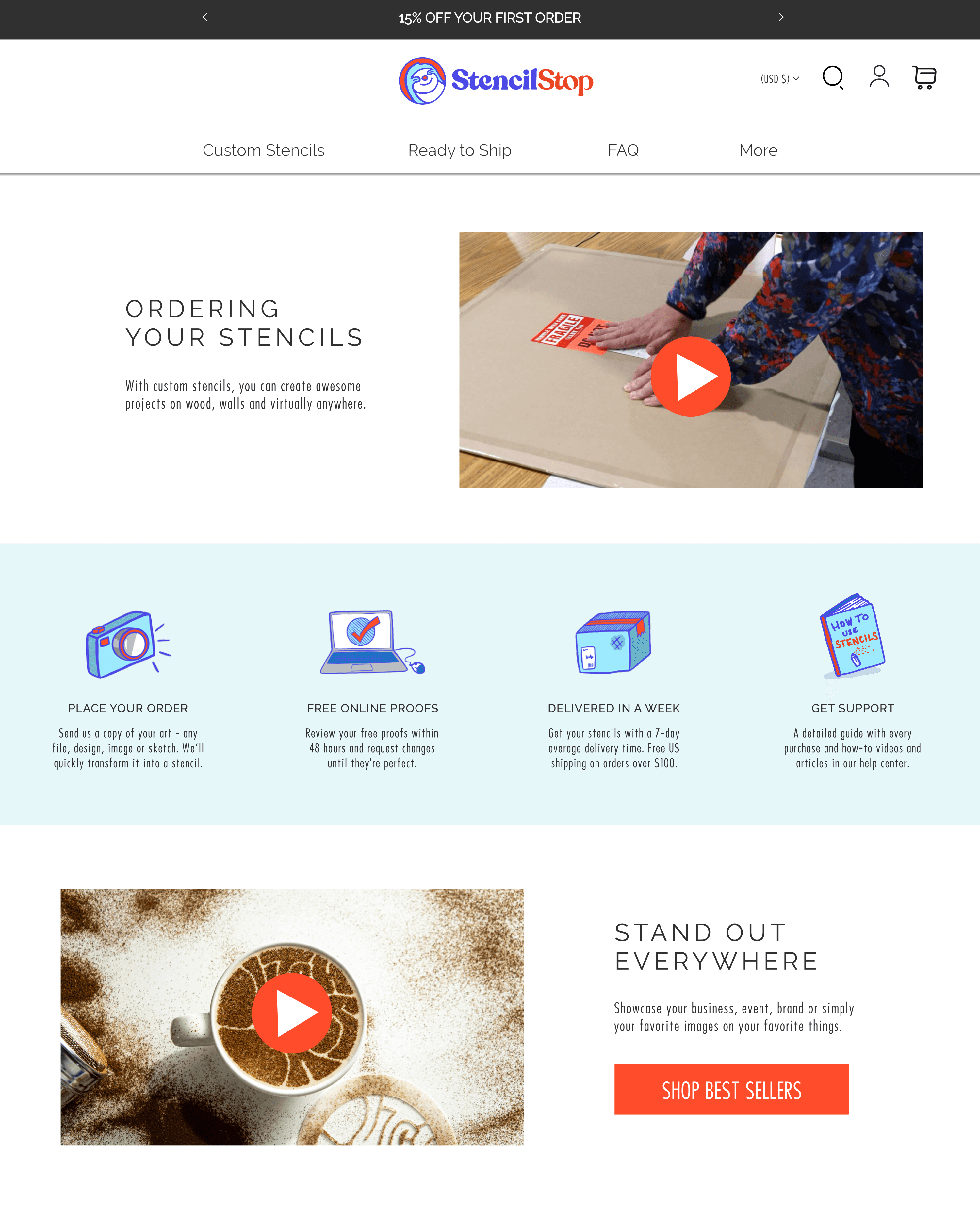

Highlights
Highlights
Contact Us be gone
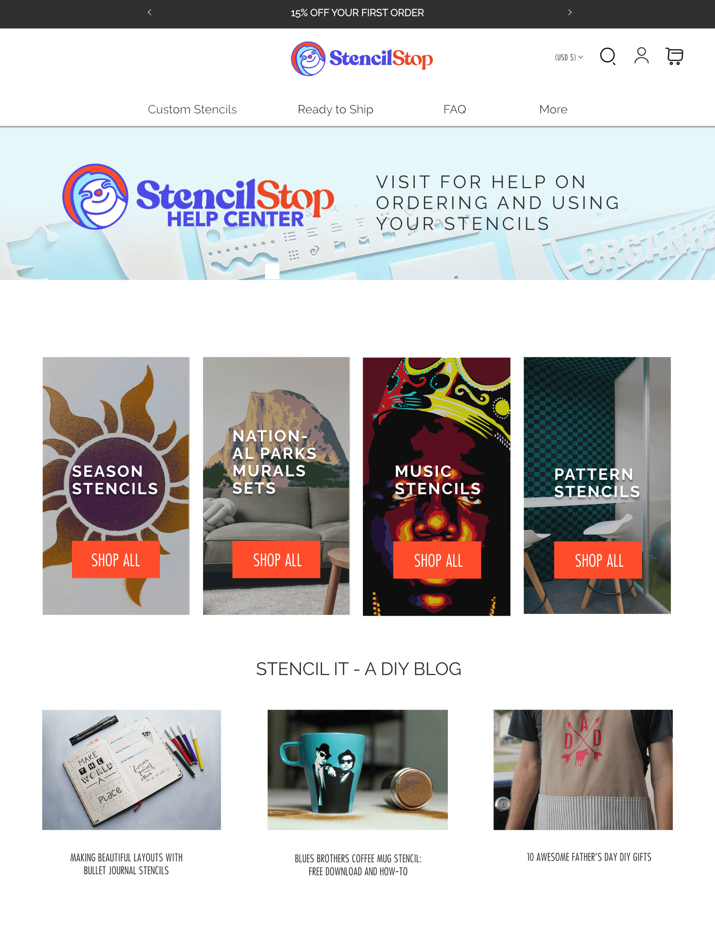
I removed the Contact Us button originally on the left side of the nav bar, which disrupted the desired user journey.
Once the button was removed, customers were led through the online purchase process more seamlessly, which decreased the bounce rate, increased sales and reduced customer service interactions.
Don't move the pop-up
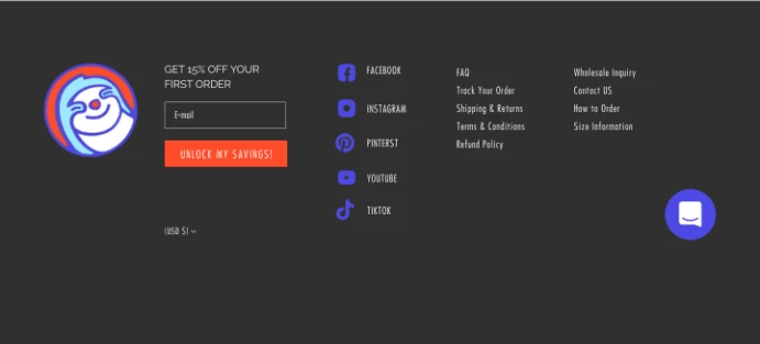
Stencil Stop initially thought the subscriber pop up was disruptive to the user experience. They considered moving it to the footer only, and I used the data to argue for it to stay put. Removing it would have been detrimental to email subscriptions and first-time purchases.
Did someone say #303030?
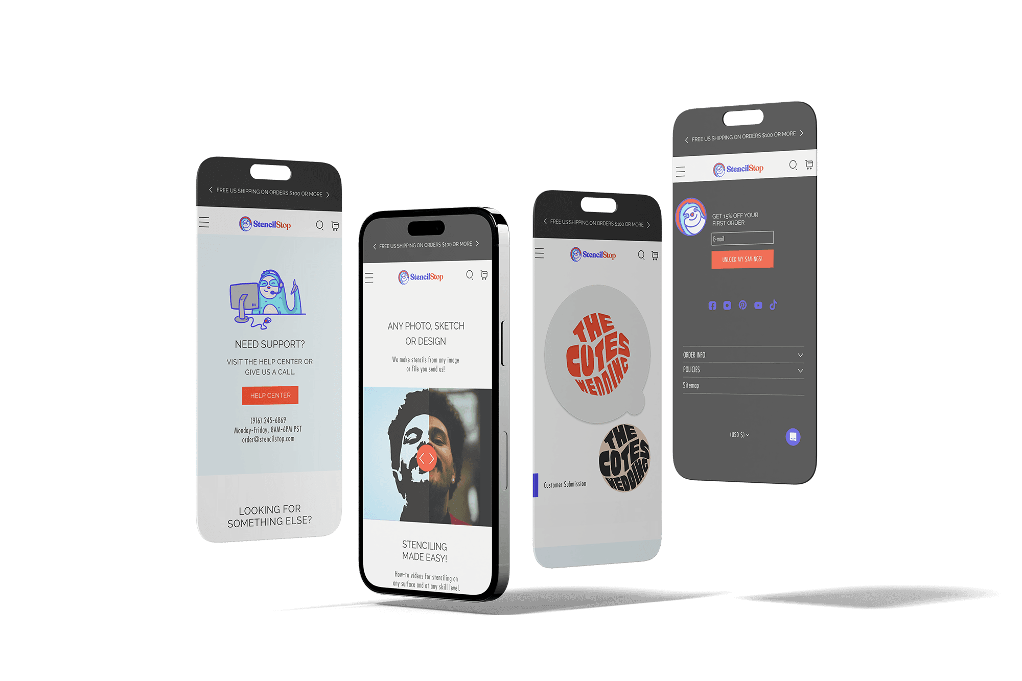
#303030 wasn't a part of the original SS brand colors. I introduced it as a way to "ground" the other brand colors and provide a much needed contrast.
It wasn't immediately accepted, but I kept adding it to visuals for approval and eventually it caught on as the main header and footer color and is now used across the website and marketing graphics.
Broken links everywhere
When updating the blog pages, I discovered countless broken URLs due to numerous products being deleted or archived and unnecessary query strings and fragments used in link backs. This created a small but intense cleanup project including updating the crawled pages on Google.
Parents for all the orphans
When updating pages, I found a few orphans. I suggested reworking one into a click-through landing page; it was organically functioning that way already.
The team and I delved into the data. I made incremental updates to the page as not to disrupt the overall Google ranking. And the click through rate increased tremendously.
I also incorporated a sitemap into the footer to keep track of all pages to avoid this issue in the future.
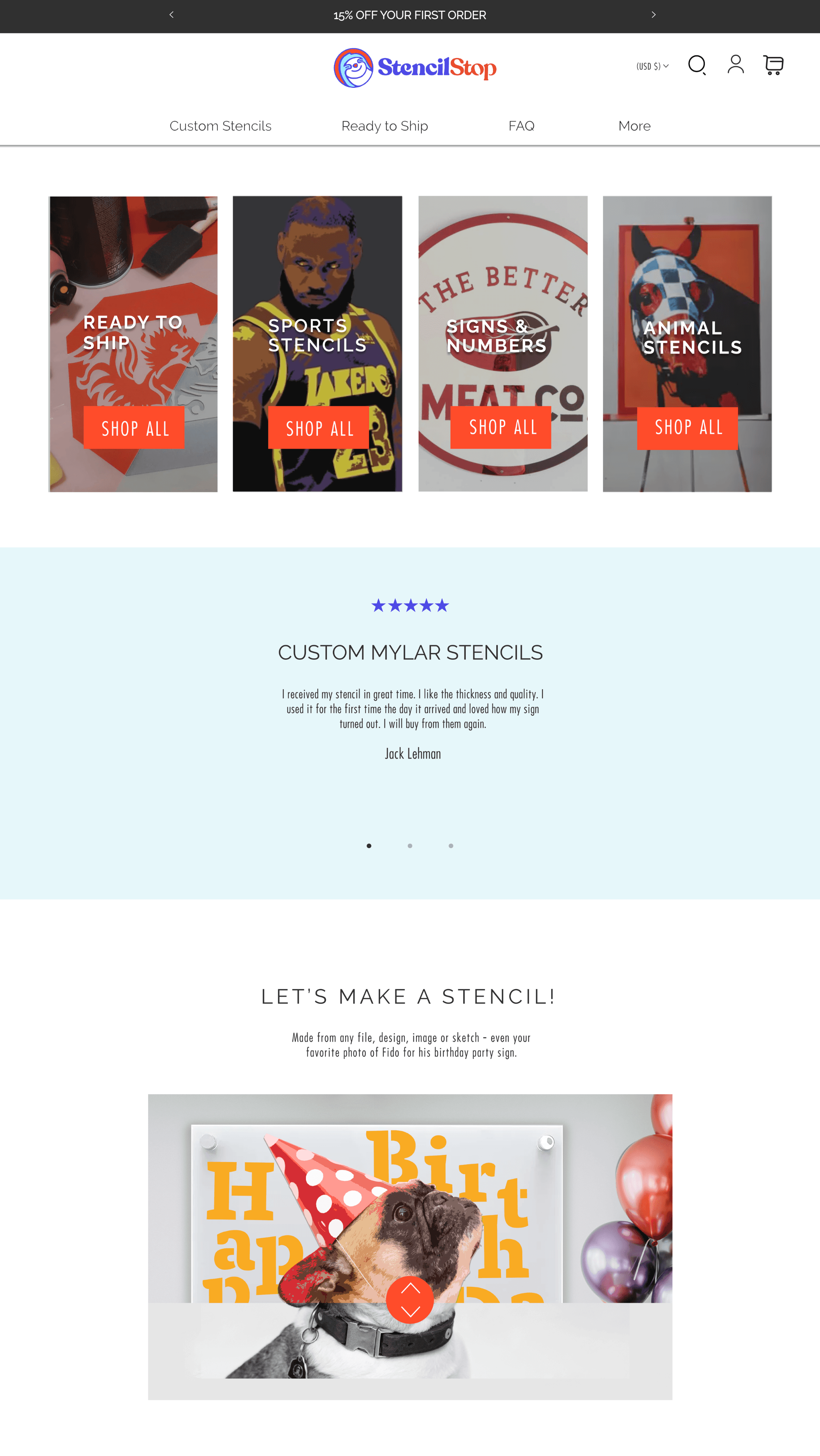





Process
Process
Step 1
Step 1
Identify Challenge
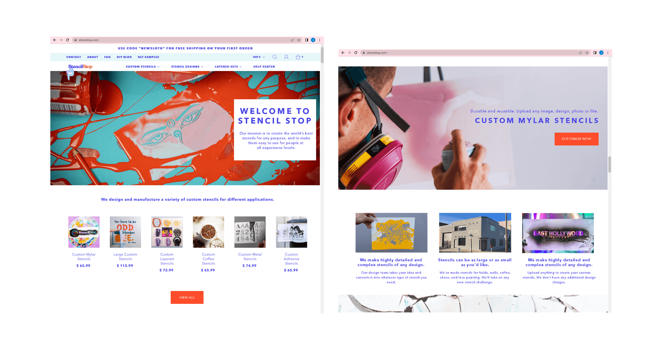
Stencil Stop's website suffered from information overload and content the brand had outgrown. Sections of the homepage and product pages didn't adequately highlight products, the ordering process or bring enough awareness to the help center and blog. There was a confusing menu and announcement bar. The hero section image wasn't engaging, and overall, the website was bogged down with too many apps, CSS and large content files.
Step 2
Step 2
Define Goals
The goals for the website included increasing clarity around products, streamlining the order process and website, decreasing bounce rates to increase conversion rates, updating the help center and blog and making them more visible, and pairing down the information and apps to improve load time and the user experience.
Step 3
Step 3
Define Phases
This included an extensive website and business structure review and conversations with the CEO. We also analyzed heatmaps, scaled back content accordingly, and identified opportunities alongside what was working and what needed improvement.
Define Phases
This included an extensive website and business structure review and conversations with the CEO and team members. We analyzed heatmaps, scaled back content accordingly, and identified opportunities alongside what was working and what needed improvement.
Define Phases
This included an extensive website and business structure review and conversations with the CEO. We also analyzed heatmaps, scaled back content accordingly, and identified opportunities alongside what was working and what needed improvement.
Step 4
Step 4
Establish content flow and design
A new content flow was needed to remedy the current issues, make more products and their use visible, and clarify the ordering process.
Establish content flow and design
A new content flow was needed to remedy the current issues, make more products and their use visible, and clarify the ordering process.
Establish content flow and design
A new content flow was needed to remedy the current issues, make more products and their use visible, and clarify the ordering process.


WEBSITE BEFORE
WEBSITE BEFORE
WEBSITE BEFORE
